Oss Mobile
One home for Brazilian Jiu-Jitsu — learning, competition prep, health, and community
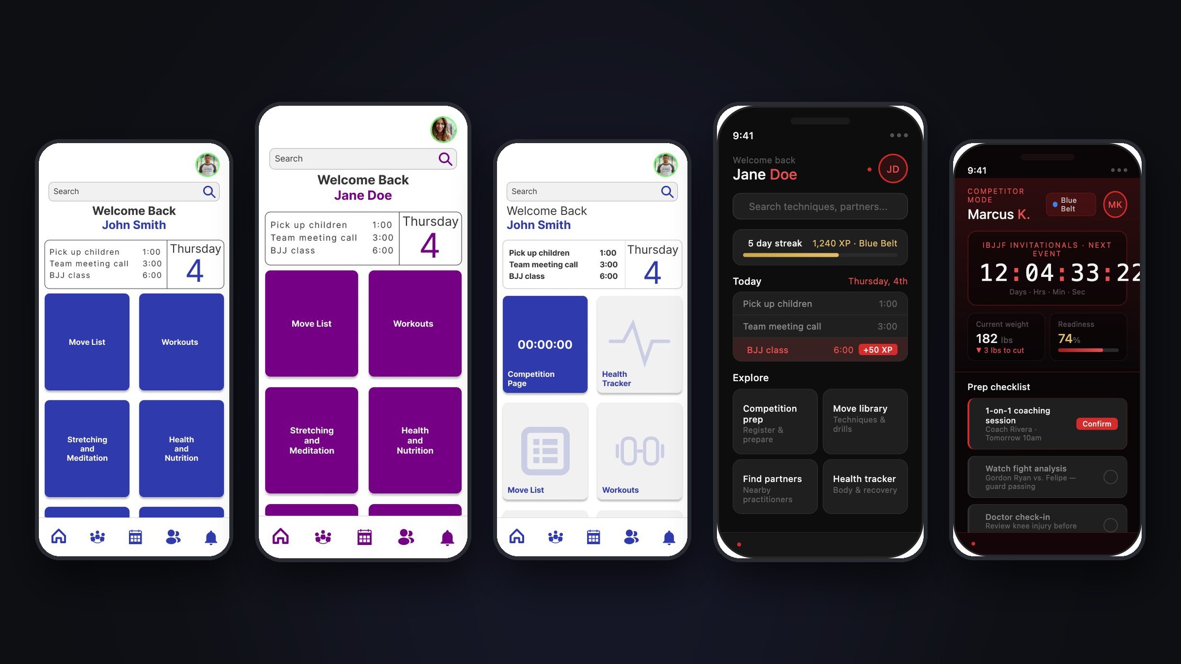
Oss Mobile is a mobile app concept that brings the scattered parts of a Brazilian Jiu-Jitsu practitioner's life into one place. I designed it end to end over 23 weeks as my Springboard UX/UI capstone — interviews, synthesis, personas, flows, wireframes, usability testing, and a high-fidelity prototype — and later revisited it with a new brand and visual system.
BJJ has millions of practitioners and no central home.
When I wanted to drill a technique from class, I scrolled YouTube and hoped the first result matched my level. When I needed a training partner or a sports doctor before a competition, there was nowhere to start.
Brazilian Jiu-Jitsu changed my life, and the deeper I got into it, the clearer the gap became. The sport's knowledge and community were scattered across YouTube, Reddit, paid instructional sites, and private gym group chats. Women, already navigating a heavily male-dominated sport, had even fewer resources built for them.
- No central hub for BJJ learning, community, or tools
- Learning resources with no structure by skill level
- Scheduling conflicts and no reliable way to find compatible training partners
- Women practitioners facing barriers with no dedicated support
- Competitors without focused tools for tournament prep and recovery
“To empower Brazilian Jiu-Jitsu practitioners with a centralized platform that simplifies learning, supports consistent training, and promotes a healthier, more sustainable lifestyle on and off the mats.”— Oss Mobile mission
Listening before designing.
I practice BJJ myself, which made my own assumptions the most dangerous thing in the room. So I started with nine interviews: seven men and two women, from total beginners to active competitors, plus a few people who don't train at all.
Each interview covered how people track their training, what gets in the way of learning (online and on the mat), how they build community, and how they manage health and recovery. I clustered every observation into an affinity map until six themes emerged.
Learning & Training
People rely on scattered sources like YouTube, with no structured progression or way to track technique.
Community & Trust
For many, their home gym was their only community; finding compatible partners felt like luck.
Women's Experience
Female practitioners described limited representation, mentorship, and support in a male-dominated space.
Competitiveness
Competitors wanted fight analysis, structured training, and tournament readiness — not just tutorials.
Discipline & Time
The most universal pain point: life gets in the way, and consistency is a constant battle.
Technology
Most people used notebooks, memory, and group chats, and wanted something smarter.
A nurse and mother of two who trains for self-defense and stress relief. Her time is limited and unpredictable, and as a woman in a male-dominated gym she struggles to find partners at her pace. "I wish I had more free time to do things I enjoy."
A software engineer with a wrestling background, training toward his first competition. Analytical and self-driven, frustrated by expensive, scattered resources. "There will always be room for improvement."
Every existing tool served part of the practitioner, never the whole.
I ran a SWOT analysis on the four platforms that came up most in interviews. None of them was built for BJJ as a whole; the community had adapted general-purpose tools out of necessity.
- YouTube — a huge free library, but no organization by skill level and wildly uneven quality that overwhelms beginners
- Reddit (r/bjj) — a large, active community, but entirely unstructured, with common misinformation
- BJJ Fanatics — world-class instructionals, but sold individually at a high price with weak organization
- Jiu-Jitsu Five-O — the closest to the Oss vision (fitness and health), but incomplete and heavily paywalled
“Not one of them was actually built for the practitioner's whole journey. That was the lane for Oss Mobile.”
Three journeys the whole app is built around.
I mapped user flows for every feature, then identified the red routes: the critical journeys that decide whether the app is useful at all. Everything else — profiles, notifications, settings — exists to get people in and out of these three quickly.
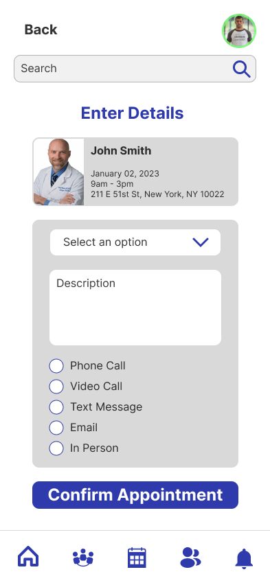
- 01Prep for Competition — tournament registration, 1-on-1 coaching bookings, and doctor appointments for injuries before an event
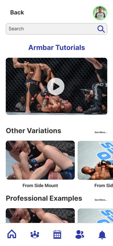
- 02Increase Move Knowledge — a move library organized by technique type, tutorials, fight analysis, and live coaching
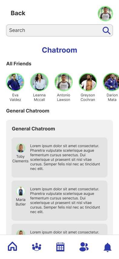
- 03Find Training Partners — a partner locator, community lounge and chatrooms, and a belt-by-belt leaderboard
Teach in real situations
Show techniques in realistic training contexts, not in isolation.
Simple first, then deep
Don't overwhelm beginners; don't hold back advanced users.
All-in-one
Learning, health, and community in one app, so nobody has to leave to get what they need.
Usable while training
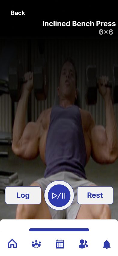
Glanceable enough to use between rounds on the mat.
One app, adapted to who's using it.
The research surfaced groups with genuinely different needs, and a single homepage couldn't serve them all. So every core screen in Oss exists in four variants, driven by the account type chosen at registration.
A hobbyist, a competitor, and a woman looking for a safe training community open the same app. What should each of them see first?
Why: Separate apps would split the community the product is meant to unite, and one generic homepage buries what each group came for. Modes keep a single shared structure, so learning a screen once works everywhere, while changing what's prioritized.
Standard
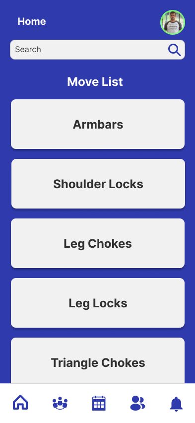
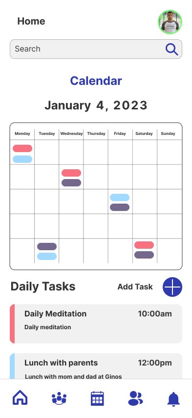
Navigation-first: a daily schedule, then Move List, Workouts, Stretching & Meditation, and Health & Nutrition.
Competitor
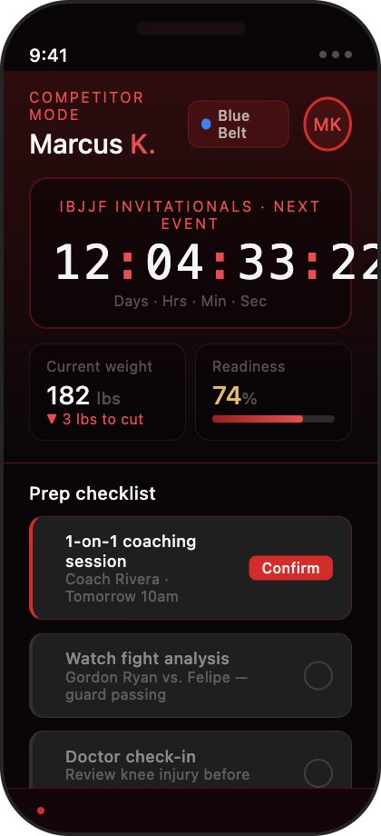
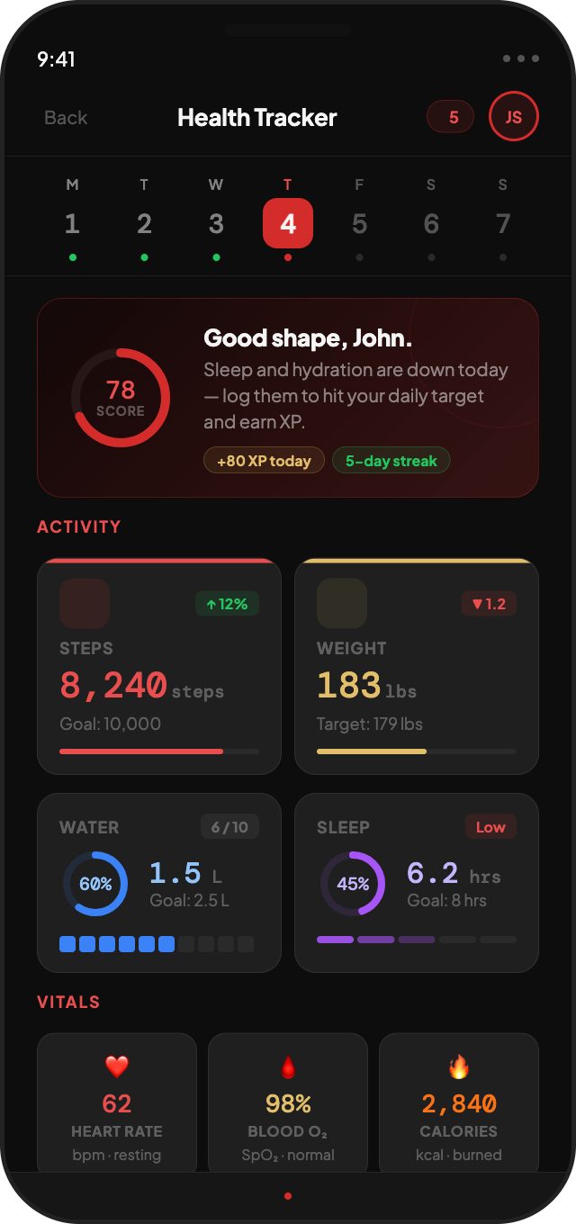
Performance-first: a competition countdown and Health Tracker lead, ahead of the move list and workouts.
Women's
The same structure in its own purple theme, with women-focused chatrooms, leaderboards, and partner lists.
Women's Competitor
Competition tools and women's community combined, so no one has to choose one or the other.
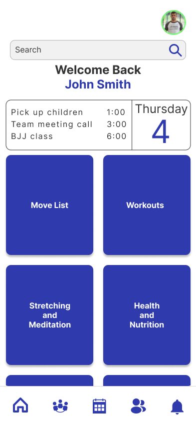
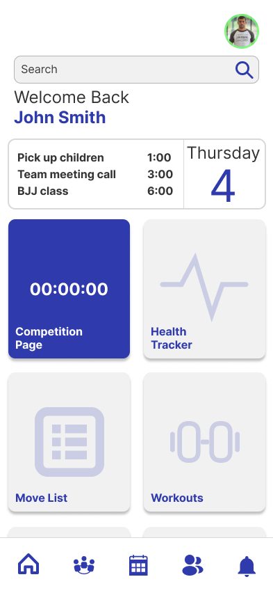
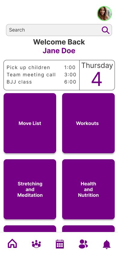
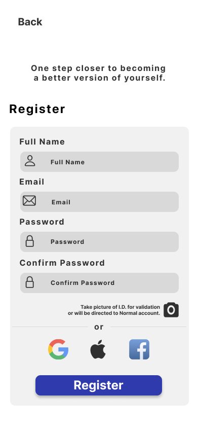
Safety shaped one detail in particular. Women's chatrooms and partner lists only work if the people in them are who they say they are, so registration includes an optional photo ID check. Anyone who skips it gets a standard account, which keeps those spaces trustworthy without adding friction for everyone else.
Users struggled more than I expected.
I tested the low-fidelity prototype with task-based sessions — find a nearby partner, book a coaching session, look up an armbar tutorial — and observed without guiding. I'd lived inside the design for weeks, and watching fresh eyes exposed every assumption I'd stopped noticing.
- 01Issue foundCritical
Back navigation didn't return people to the previous screen.
On mobile, broken back navigation destroys trust immediately; participants got stuck mid-flow.
How I solved itBuilt one reusable back-button component that always routes to the previous screen, and used it on every screen.
- 02Issue foundCritical
Not enough cues to show where to go next.
Participants hesitated on screens that should have been obvious.
How I solved itAdded contextual tooltips and short instructional pop-ups at the specific steps where people got stuck.
- 03Issue foundMajor
Buttons and page transitions animated inconsistently.
Motion changed from section to section, which made the app feel unfinished and unpredictable.
How I solved itAudited every interaction and defined one motion system — the same timing and easing for all buttons and transitions.
- 04Issue foundMajor
Switching between major sections was confusing.
People couldn't tell where they were without backtracking several screens.
How I solved itMade section names tappable links and added a section selector to registration, so the app's structure is clear from day one.
- 05Issue foundMajor
Timers, buttons, and menus kept their old state.
Returning to a screen showed stale countdowns and menus left open.
How I solved itReviewed every stateful element and reset it automatically when the user leaves the screen.
The three journeys, brought to life.
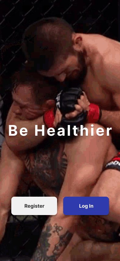
With the testing issues fixed, I built the high-fidelity prototype in Figma: a fully clickable experience covering all three red routes. Every design decision traces back to the research, the testing, or the four principles.
Coming back with a real brand and a design system.
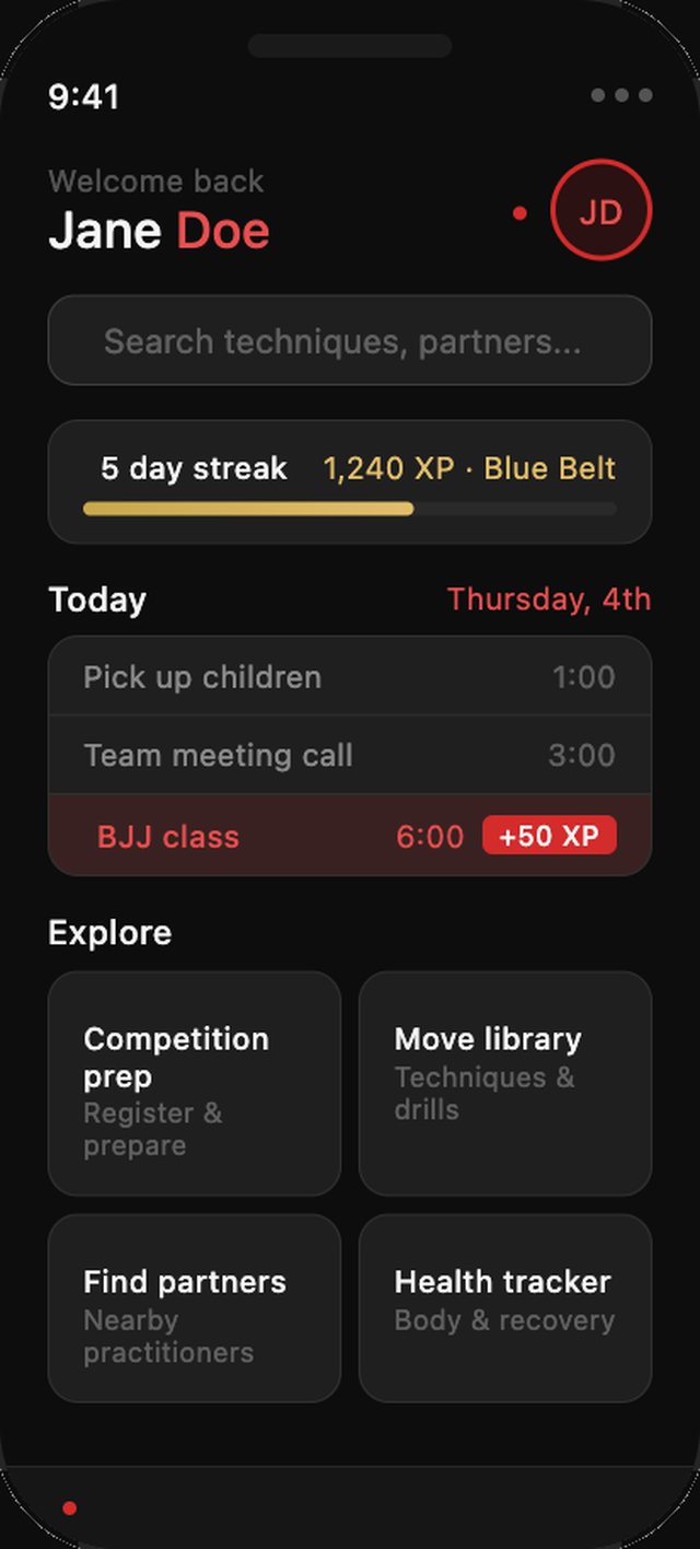
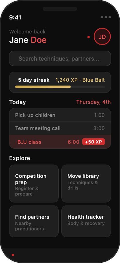
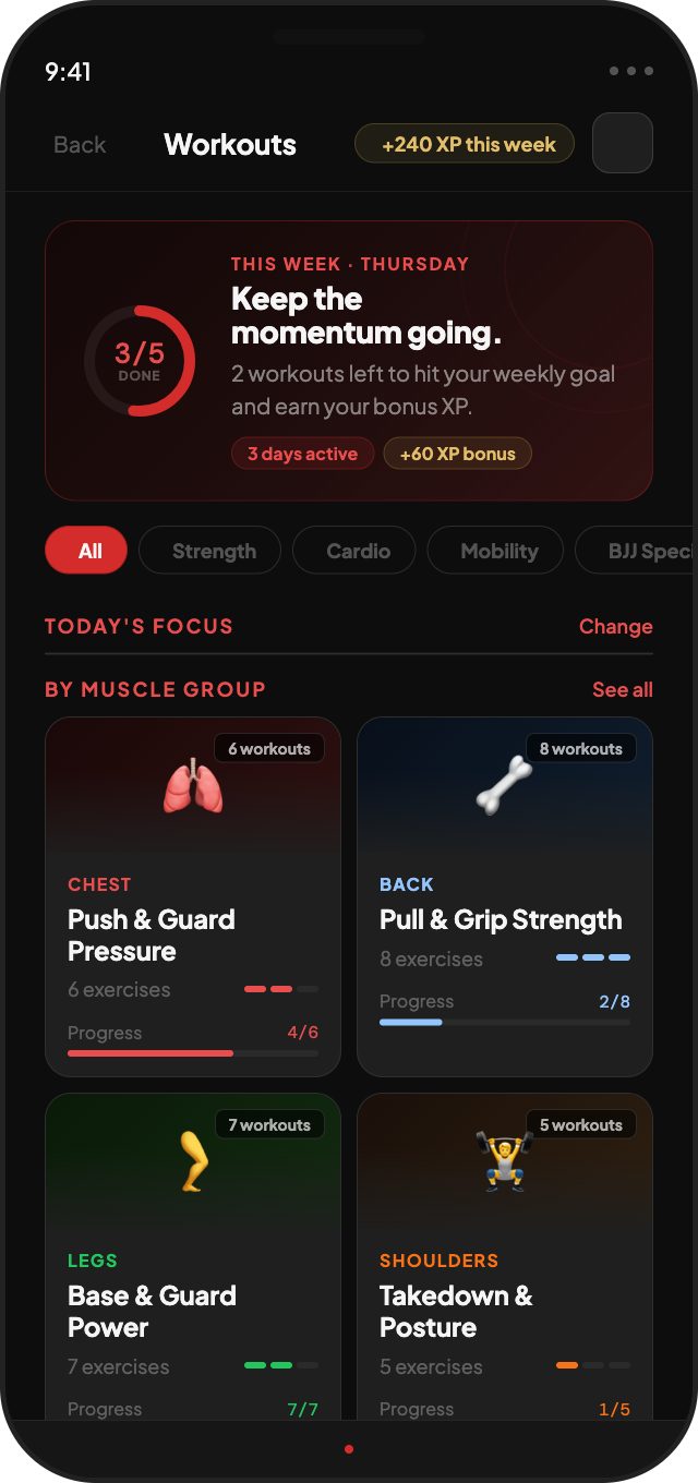
My capstone reflection named visual refinement and a proper design system as the biggest gaps. So I came back to Oss and rebuilt its identity: a brand guide, a color system tied to the sport, and redesigned core screens.
Belt progression colors
White, blue, purple, brown, and black belt colors act as accents, so progress in the app mirrors progress on the mat.
Performance red for competitors
Competitor mode shifts to a dark, data-heavy layout with red accents, built around the next event.
Progress you can feel
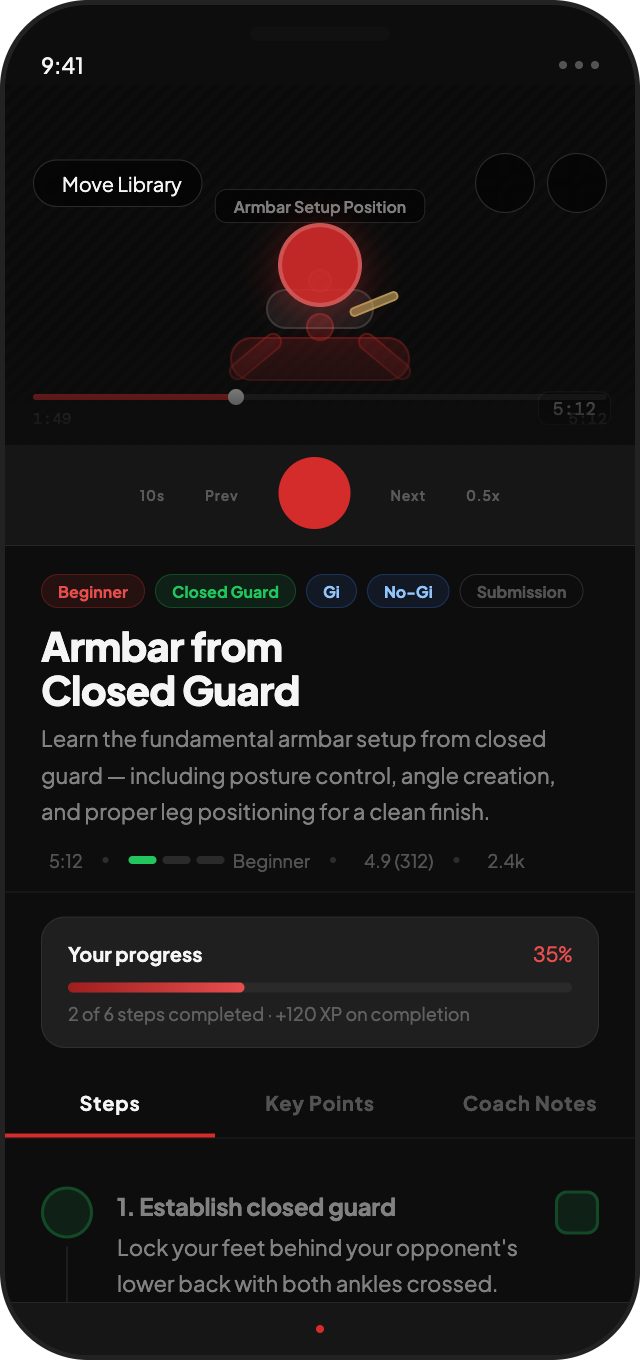
Streaks, XP, and step-by-step lesson progress reward consistency — the biggest pain point from research.
Fast, controlled motion
200–250ms transitions with minimal bounce: disciplined, like the sport.
What the project delivered.
- A research-backed concept grounded in 9 interviews and 120+ observations
- Three red routes that anchor the entire information architecture
- Four adaptive modes serving hobbyists, competitors, and women from one shared structure
- Five usability issues found in testing and resolved in the high-fidelity prototype
- A follow-up brand and design system that addresses the gaps I identified in my own reflection
Oss Mobile is a concept, not a shipped product, so I evaluated it through research and prototype testing rather than live metrics. Next, I'd explore an AI coaching assistant, wearable integration for training load and recovery, and a freemium model with a paid competitor tier.
What I learned.
You can't see your own blind spots
I expected testing to surface minor tweaks. It surfaced real navigation failures I'd stopped noticing because I knew every path through the app. More eyes, earlier, is a structural part of good design.
Mobile is its own language
No hover states, one thumb, 390 pixels. Icons had to be instantly recognizable and tap targets large enough to hit between rounds, not just at a desk.
A design system is infrastructure
The inconsistent animations testers flagged were a symptom of having no system. Revisiting Oss with a real brand and component rules is the lesson applied.