Cura Dental
Redesigning a dental practice's website around the questions nervous patients actually have
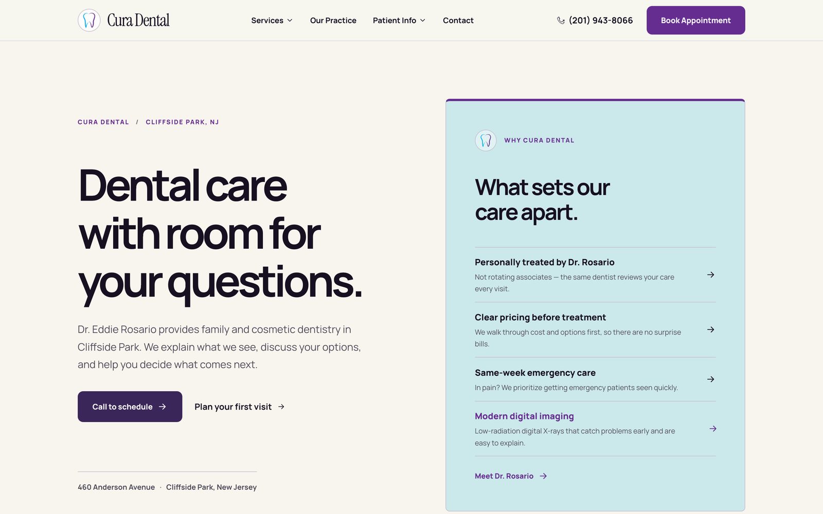
Cura Dental is Dr. Eddie Rosario's family and cosmetic practice in Cliffside Park, NJ. I audited the existing site, then redesigned and rebuilt it as a 23-page site: clearer calls to action, real pricing up front, a service-page system written for search, and a mobile experience where calling the office is always one tap away.
A website that earns trust before it asks for a booking.
Most people land on a dentist's website anxious about two things: whether it'll hurt, and what it'll cost. The old Cura Dental site answered neither.
I worked on this project as designer, digital marketer, and developer: I audited the existing site, defined the information architecture, wrote the SEO structure for every service page, explored two visual directions, and built the final 23 pages. Every fact on the site (pricing, credentials, reviews, hours) comes from the practice's real information. Anything the practice hadn't confirmed yet was left as a flagged gap in the content file rather than invented.
What the original site got wrong.
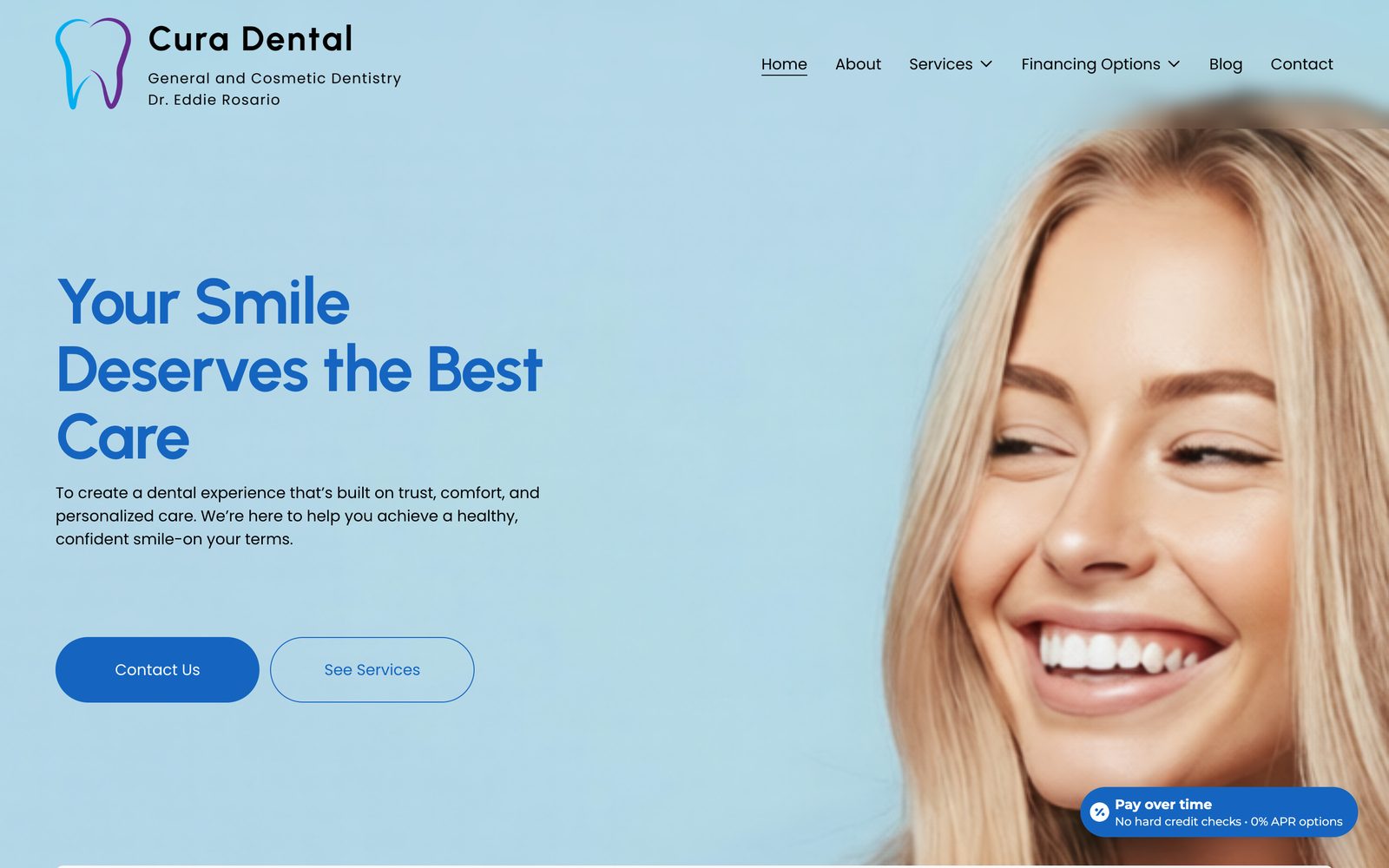
Before designing anything, I walked the existing curadentalnj.com as a first-time patient would, on desktop and on a phone. Drag the slider to compare the original homepage with the redesign.
- 01Issue foundCritical
No way to call from the top of the page.
The phone number wasn't in the header, and the two hero buttons were "Contact Us" and "See Services" — neither is a booking.
How I solved itPut the phone number in the navigation on every page, made "Call to schedule" the primary action, and added a persistent "Book Appointment" button.
- 02Issue foundMajor
A headline any dentist could use.
"Your Smile Deserves the Best Care" over a stock photo of a model says nothing about this practice.
How I solved itRewrote the hero around a specific promise ("Dental care with room for your questions") and paired it with a panel of real differentiators: treatment by Dr. Rosario himself, clear pricing before treatment, and same-week urgent care.
- 03Issue foundMajor
Overlapping, third-party UI inside the hero.
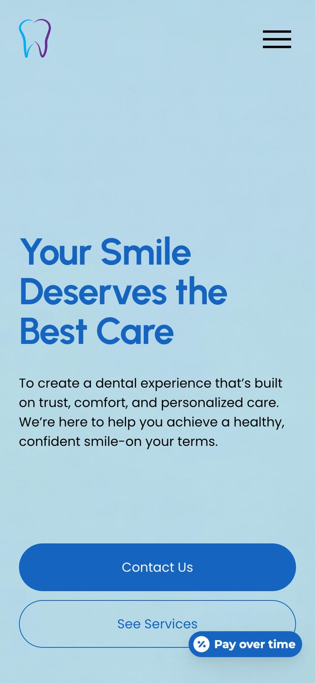
A floating "Pay over time" badge sat on top of the hero, and on mobile it covered the "See Services" button. A review widget displayed its own "Free Google Reviews Widget" branding.
How I solved itMoved financing into its own page and navigation item, and gave patient reviews a native, designed section instead of an embedded widget.
- 04Issue foundMajor
Pricing and financing were hard to find.
The $195 new-patient exam and financing options existed, but not where a price-anxious visitor would look first.
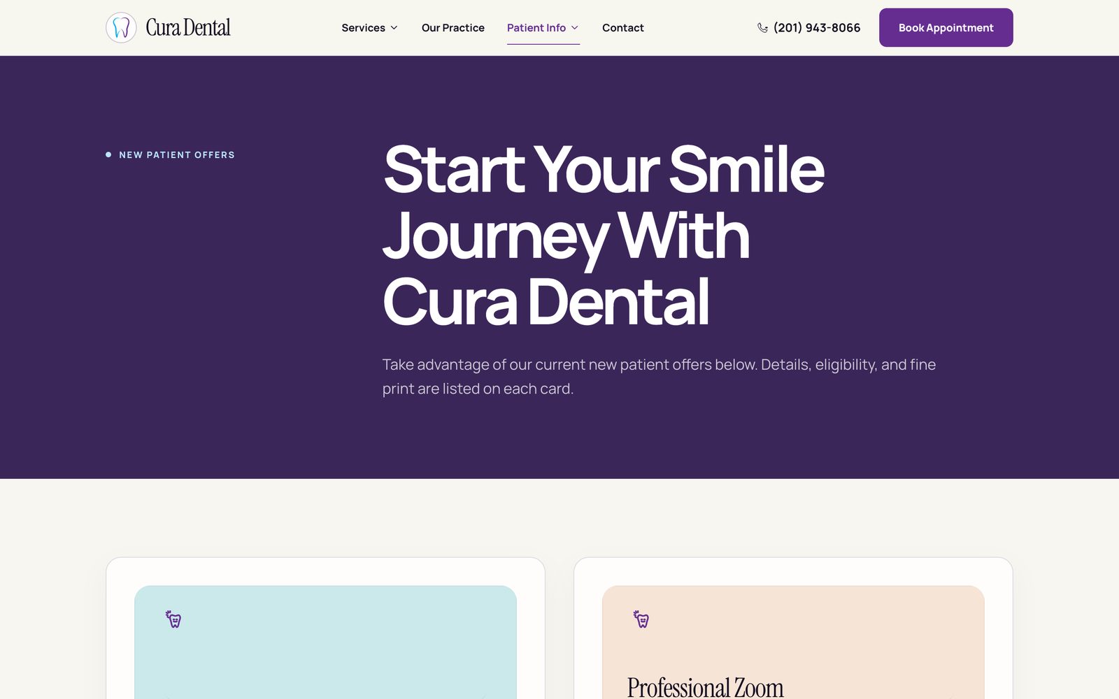
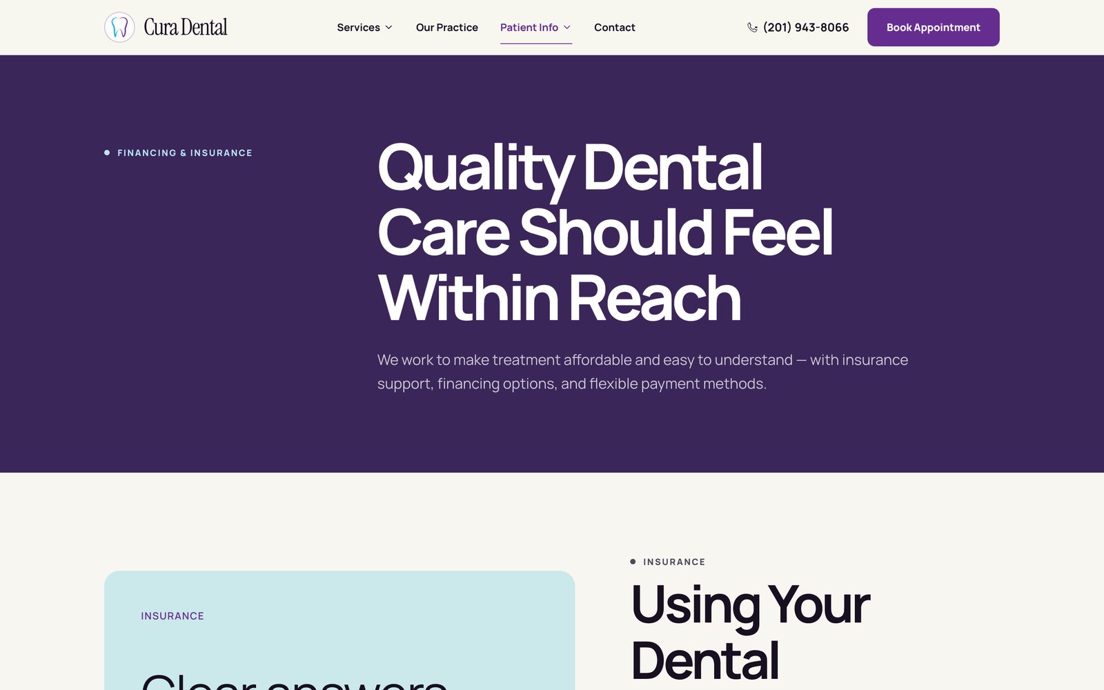
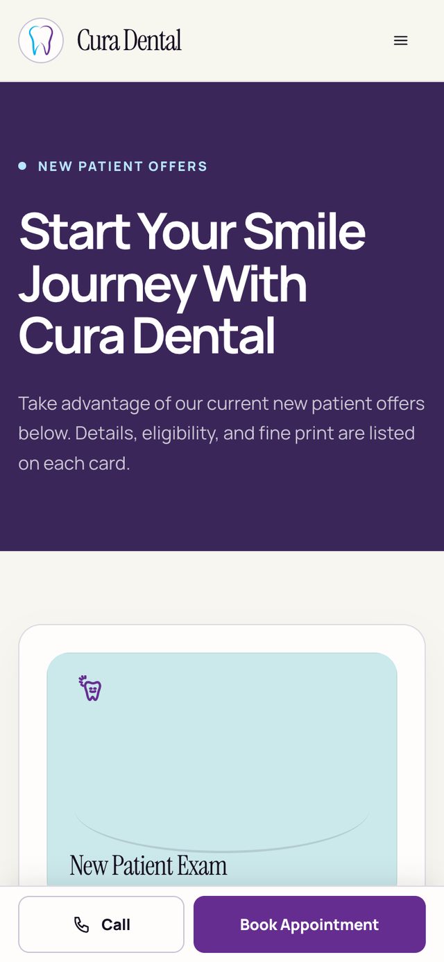
How I solved itCreated a dedicated New Patient Offers page and a Financing & Insurance page, both reachable from a "Patient Info" menu and linked from the homepage.
Organizing the site around patient questions, not the practice's org chart.
A nervous first-time patient is really asking four questions: Can this practice fix my problem? What will it cost? Who will actually treat me? How do I book? I restructured the navigation so each question has an obvious home.
Services
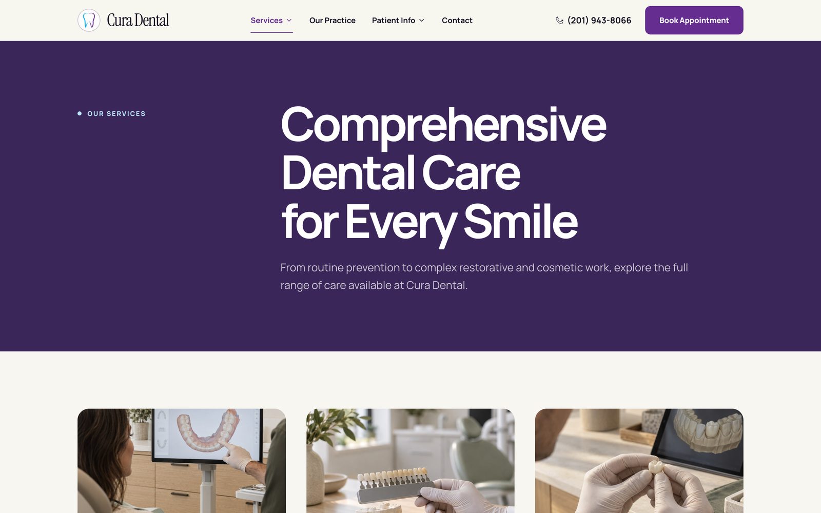
All eight service lines in a dropdown, each with its own page following one consistent template.
Our Practice
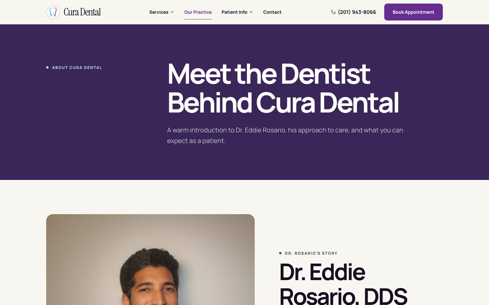
Dr. Rosario's real credentials and approach — NYU College of Dentistry, residency at NewYork-Presbyterian Brooklyn Methodist.
Patient Info
New-patient guide, current offers, financing and insurance, FAQs, an emergency guide, and the blog.
Contact
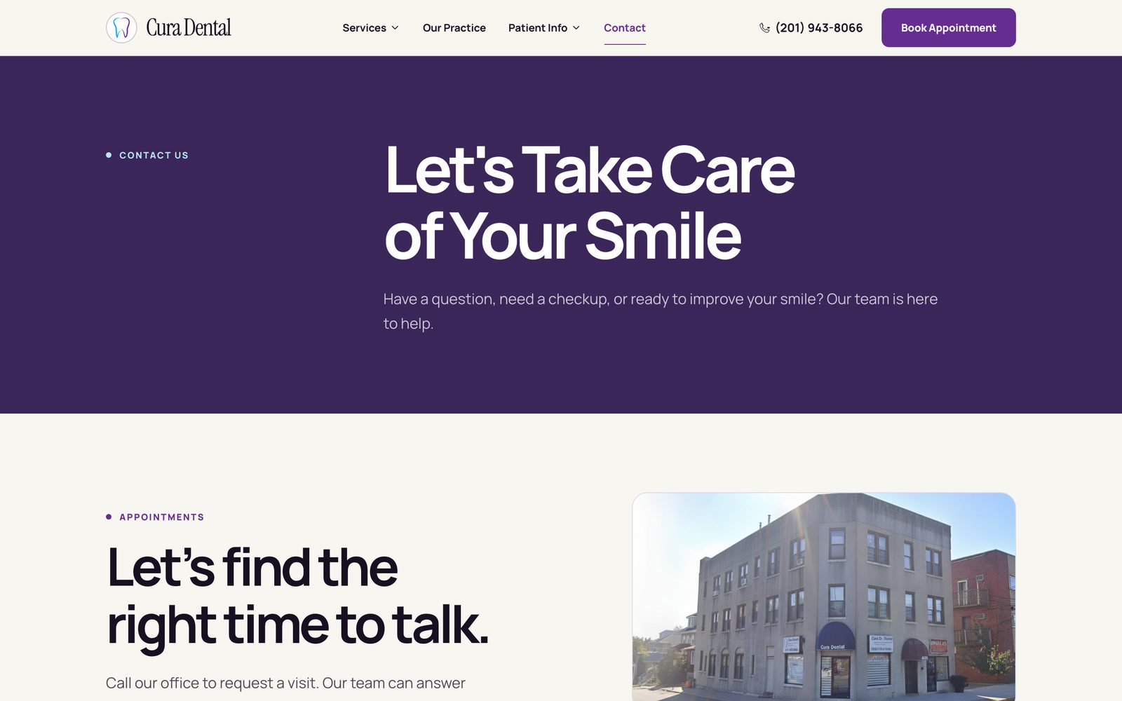
Always one tap away, plus the phone number and Book Appointment button in the header on every page.
What should a first-time visitor see first on the homepage?
Why: Nearly every local practice offers the same core services, so a service grid doesn't help anyone choose. What moves an anxious visitor to call is believing they'll be listened to and knowing the next step, so both had to be visible without scrolling.
The first direction didn't survive contact with reality.
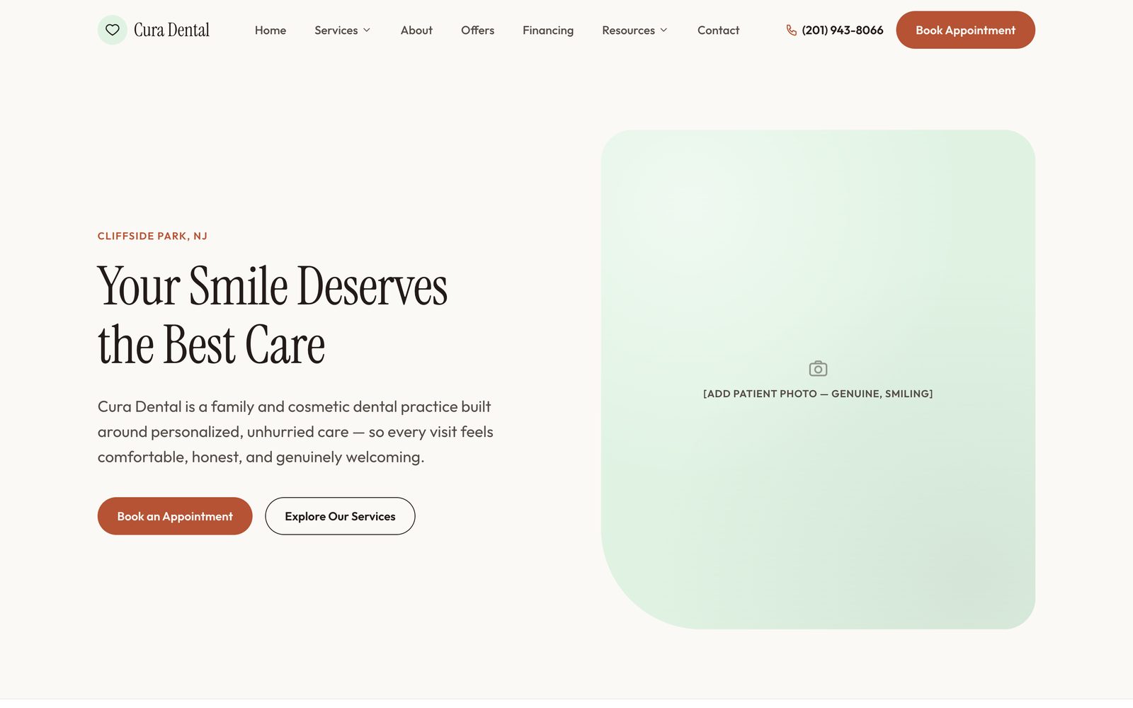
My first version used a warm terracotta palette and an editorial serif. Reviewing it critically, I saw two problems. It had quietly inherited the old site's headline, so it looked new while saying the same generic thing. And its hero depended on patient photography the practice didn't have yet, which left a placeholder where the most important image on the site should be.
Terracotta accent, serif headline, the old "Your Smile Deserves the Best Care" copy, and a hero that only works once real patient photos exist.
A porcelain base with a deep violet accent and Manrope, a new headline written for anxious patients, and a hero carried by typography and a differentiators panel, so it works without photography.
One service-page template, written for patients and for search.
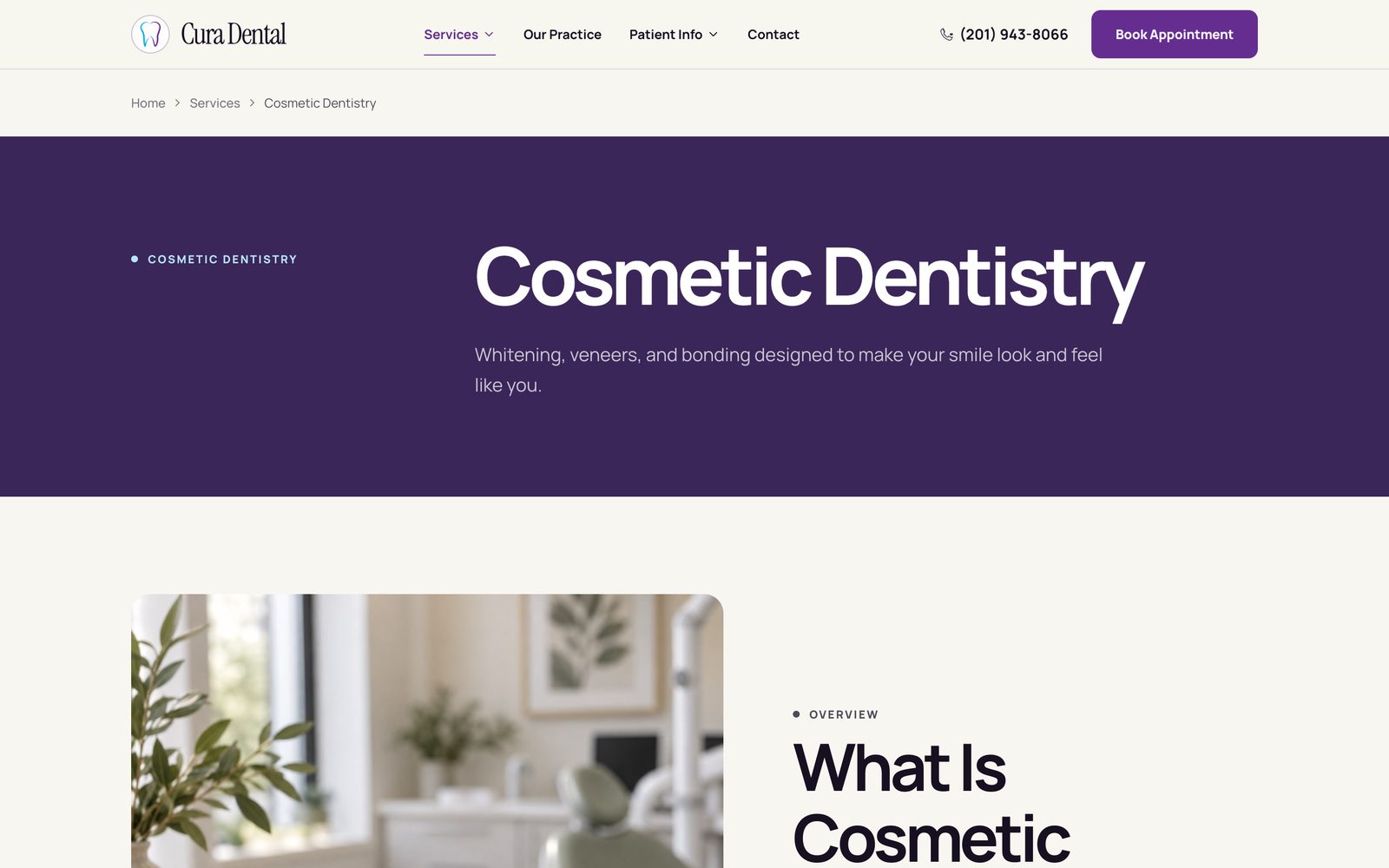
Local search is how a dental practice gets new patients, so every service page follows the same structure, built from an SEO brief I wrote for all eight service lines.
- Location-targeted titles on every page — "Cosmetic Dentistry in Cliffside Park, NJ | Cura Dental" — with a written meta description for each
- A consistent page outline: what the treatment is, who it's for, what to expect, benefits, recovery, and FAQs
- Internal links between related services (preventive care → restorative care) so both patients and search engines can follow the path
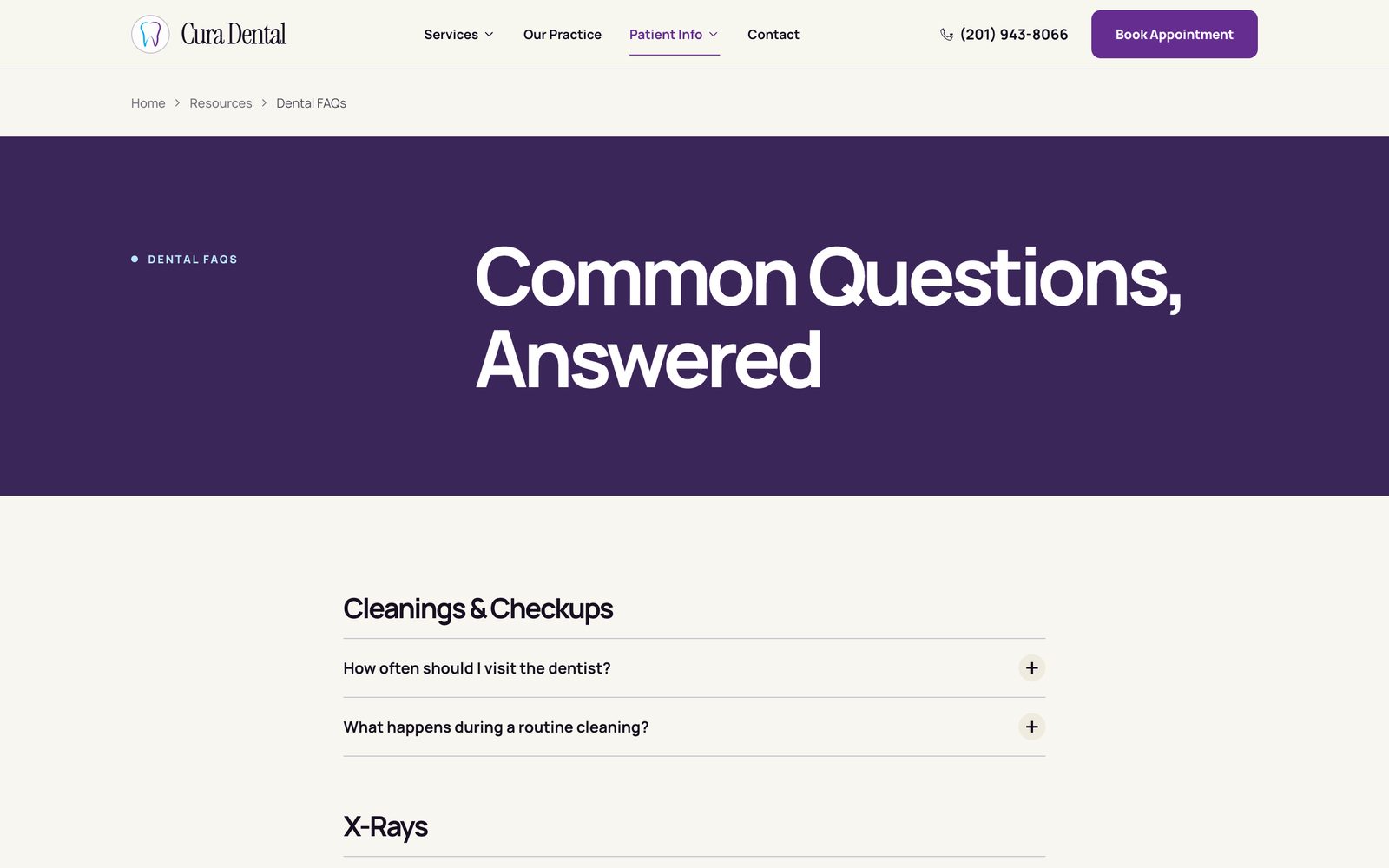
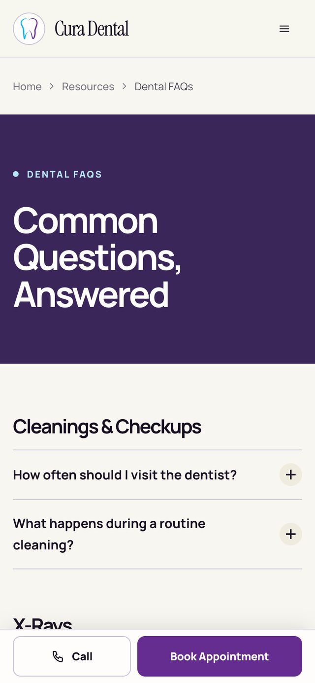
- FAQ accordions built with native <details> elements, so the answers are real page content rather than hidden behind scripts
- LocalBusiness structured data (schema.org/Dentist) with the practice's address, phone, and hours

Calm and clinical, without looking sterile.
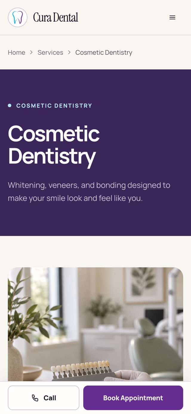
The system is a porcelain base, deep violet for headers and primary actions, and pale sage, blue, and peach tones to separate sections. Manrope carries the interface and headlines, with Instrument Serif used sparingly for emphasis. Every interior page opens with the same bold violet header, so patients always know where they are.
Designed for a phone in one hand.
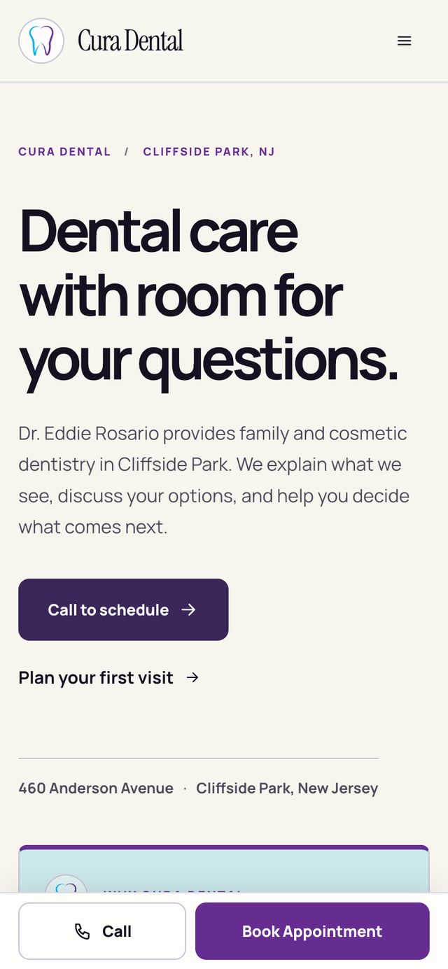
Urgent searches like "dentist near me" happen on phones, often while someone is already in pain. On mobile, Call and Book Appointment stay pinned to the bottom of every page, navigation opens as a full-screen drawer, and every tap target is at least 44px.
- Semantic HTML with a skip link and visible focus states
- FAQ accordions that work even with JavaScript turned off
- prefers-reduced-motion respected for every animation
- A dedicated accessibility statement page
A component system without a JavaScript framework.
The machine I built on had no Node.js, which ruled out a typical Next.js or React build.
Why: Python's standard library was already there. I wrote reusable render functions (Nav, ServiceCard, OfferCard, ReviewCard, FAQ accordion, PageHero) and composed them from a single content file. That gave me the same separation of content and layout a component framework would, and the output is plain HTML, CSS, and JavaScript that any host can serve.
Every editable fact on the site — services, offers, reviews, Dr. Rosario's bio, FAQs — lives in one content file. The practice (or a future developer) can update it without touching layout code. Information the practice hasn't confirmed yet, like an office email address or accepted insurance plans, is flagged there instead of guessed.
A site that matches the practice's real reputation.
- 23 pages organized around the four questions new patients actually ask
- A phone number and booking button visible on every page, and pinned on mobile
- Real pricing, financing, and insurance information surfaced instead of buried
- Eight service pages on one SEO template, with 98 patient questions answered on-site
- A content file the practice can update without touching layout code
This is a client project, so I'm measuring it against the goals we set rather than a controlled experiment. The next step is tracking calls and organic search traffic once the new site has been live long enough to compare.
What I learned.
Audit before you design
Walking the old site as a nervous patient, on a phone, surfaced the real problems — a missing phone number, a badge covering a button — faster than any moodboard would have.
Be willing to throw out a first direction
Direction 1 looked polished, but it recycled the old headline and depended on photos that didn't exist. Admitting that early made the final site stronger.
Trust is the conversion lever
For a local healthcare practice, the deciding factor isn't a feature comparison; it's whether a visitor believes they'll be taken care of. Real pricing, a real doctor, and an obvious next step did more than any visual flourish.